Leading Design for Juvéderm’s Website
Challenge & Background
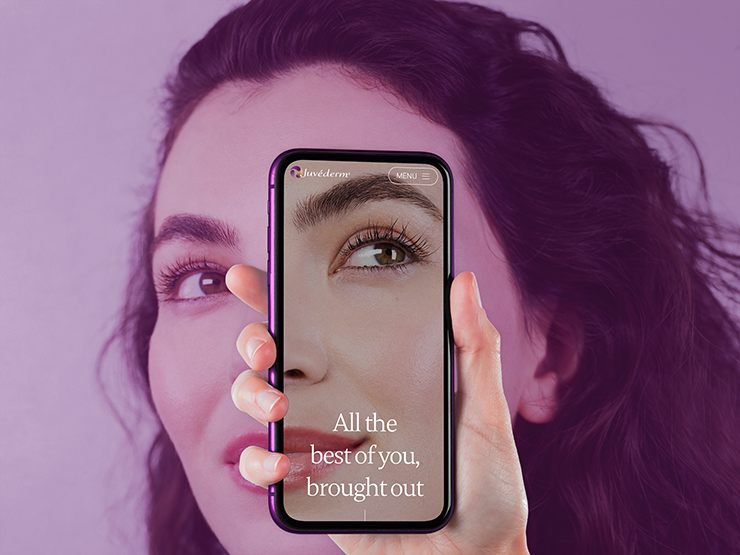
Juvéderm, a product of Allergan Aesthetics, needed a website redesign that’d work globally for branded and unbranded markets using a modular mindset, user-centered design and mobile-first approach.
The website should be the place to make the final consumers see themselves within the category (facial fillers, as opposed to onabotulinumtoxinA or plastic surgery) and to provide information and tools to lead them to book a consultation.
My Contribution
Kick-off Workshop
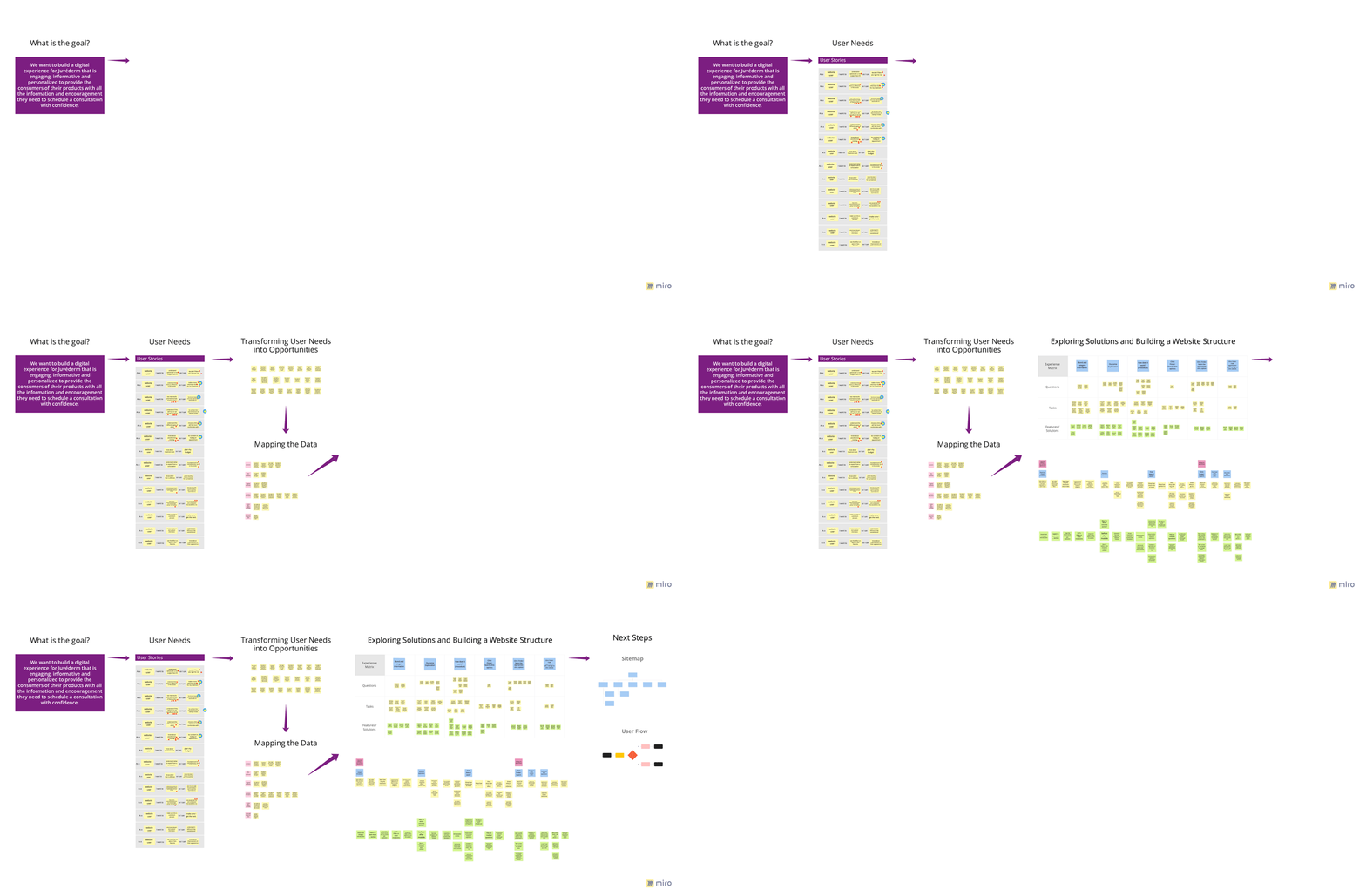
The workshop had as attendees stakeholders from different areas from the client side together with part of our team. We took them all into time-travel to the future where the project was successfully completed and share with us what goals they think were achieved. With the answeres, dot voting and consensus, we came up with a mission goal that would guide us throughout the project.
“Build a digital experience for Juvéderm that is engaging, informative and personalized to provide the consumers of their products with all the information and encouragement they need to schedule a consultation with confidence. ”
Understanding the Context
The sequence of methodologies below were used to gather knowledge about the user and their pain points. We also relied on the research material that was handed by the client to then build the rationale that’d backup the sitemap creation and later the wireframes.
Sitemap & Content Structure
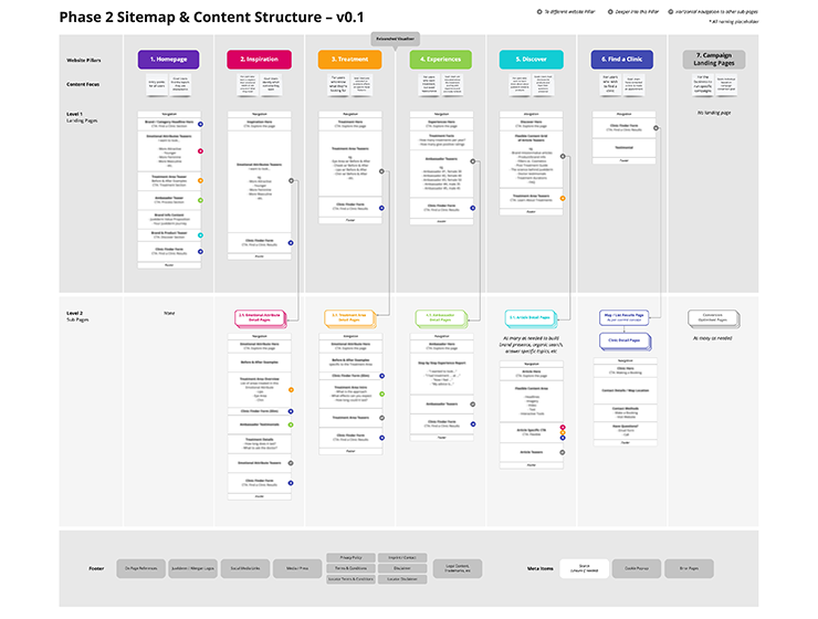
The whole experience was then reflected in the information architecture.
The modular mindset was used in a way to guide the user into deeper levels of category education guiding them to a deeper stage of the conversion funnel to book an appointment.
Design Implementation
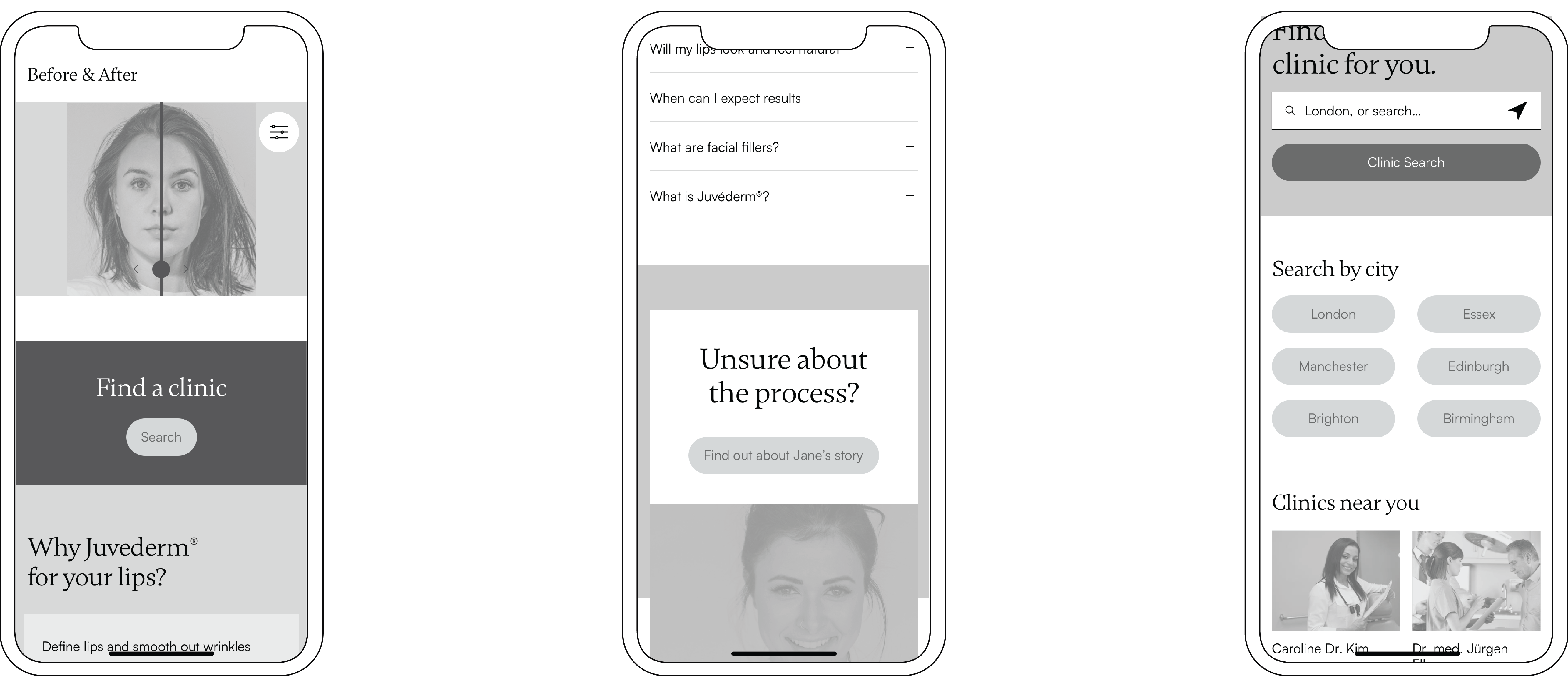
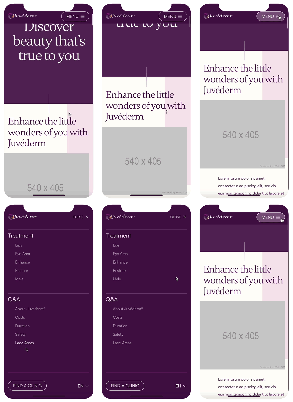
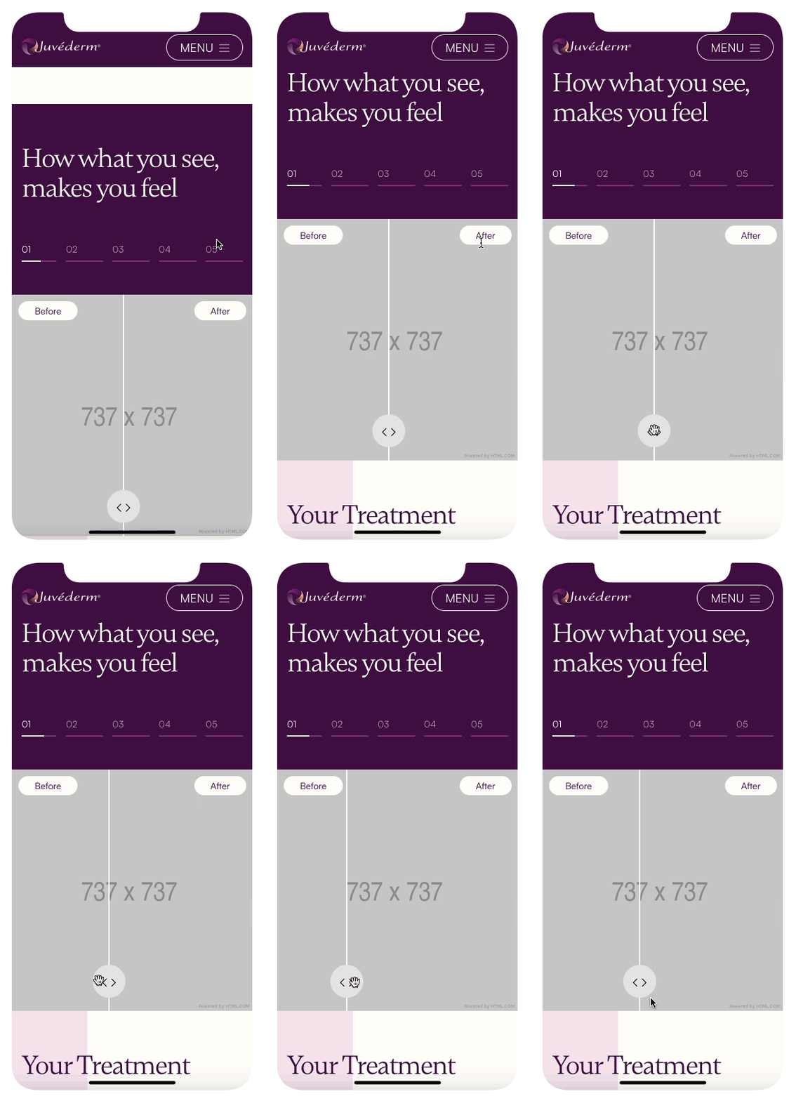
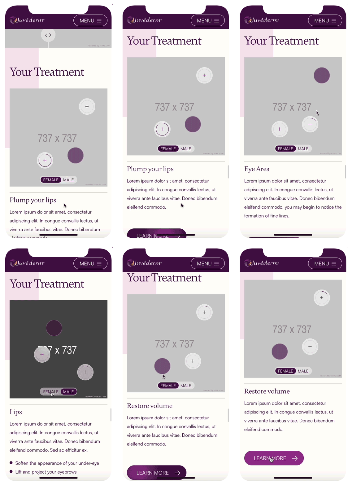
Our design solution gives the user clear educational journey, allowing them to gather information in an accessible way, explore natural outcomes of different procedures and search for the most suitable practitioner to book a consultation.
Technology enables user empowerment and engagement, and a satisfying experience goes beyond mere usability. We used microinteractions to enhance the website's look and feel, making it more engaging and enjoyable.
Digital Style Guide
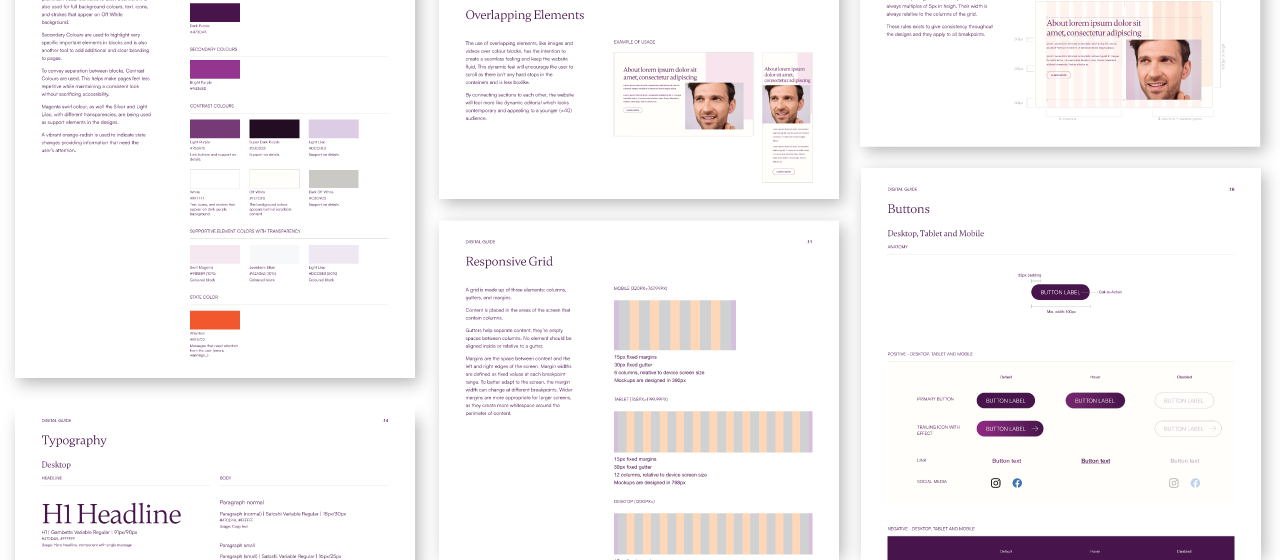
To ensure consistent brand and UI elements across the website, we developed a digital style guide with clear rules. This blueprint enabled us to collaborate effectively with all of the designers and developers involved in the project creating new pages more efficiently.
Final Considerations
During the project’s progress, it was needed to decrease the scope of pages and simplify the sitemap due to possibility of content creation.
What I’d do differently: It would have been better to integrate the content into the design process at an earlier stage to allow us to take even more of a form-follows-function approach and further optimise the user experience for engagement and conversion rates.
*This is a overview of the project trajectory. For privacy reasons, I am not at liberty to show more specifically on what I worked.*