Creating Consistency Across Products Within Bayer

Challenge & Background
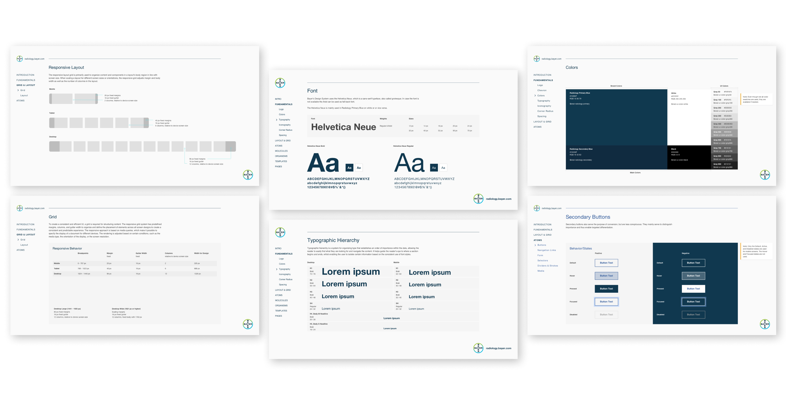
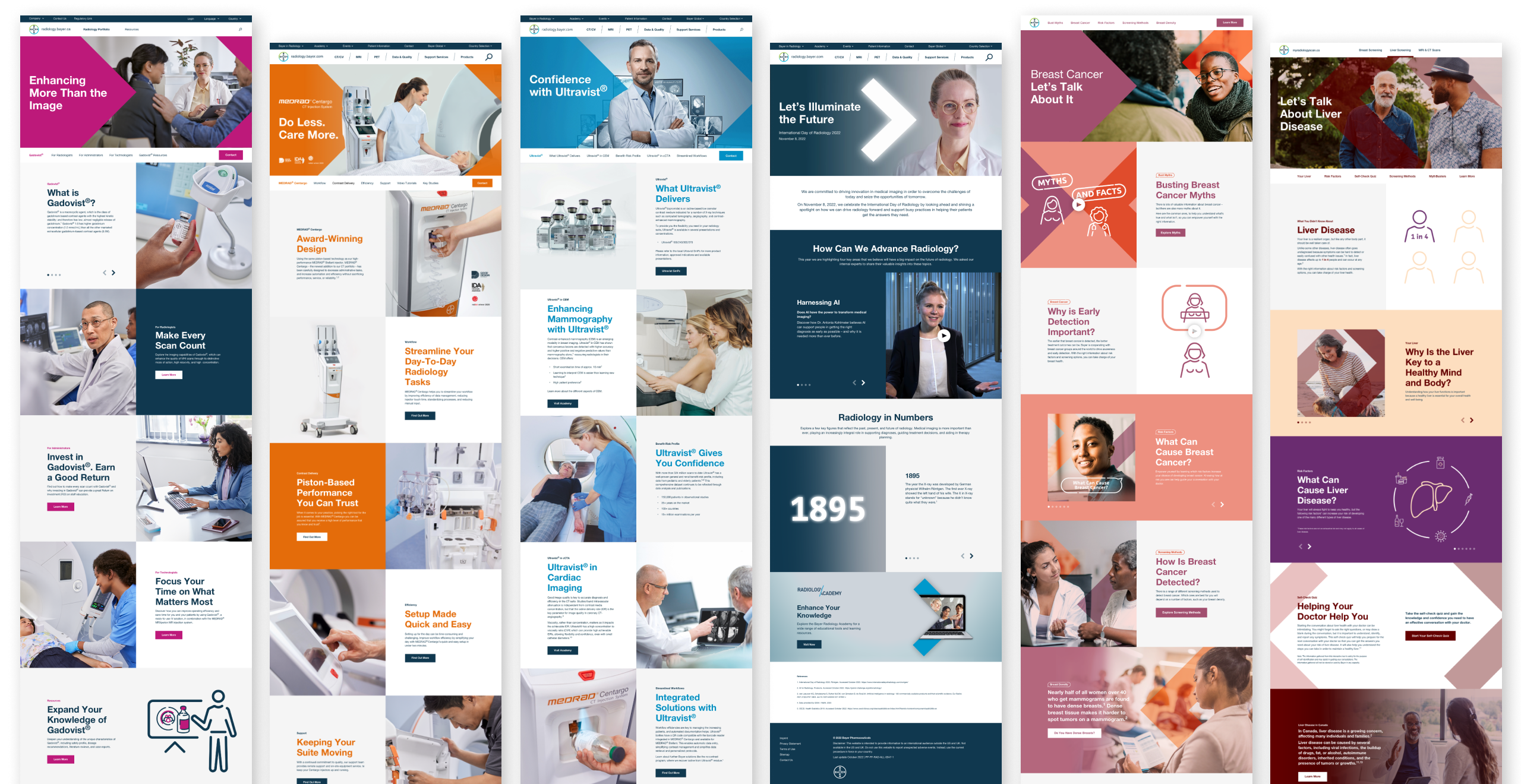
As a world-leading diagnostic imaging solutions provider, it was needed a UX and UI solution that would unite and organize their product portfolio with cohesiveness, intuitive navigation and a modern interface. The first step after making an interface inventory was to start building their first Design System, dearly called BRAD (Bayer RADiology).
Navigating towards standardization and consistency, it was equally important to set processes so a brand of this magnitude could scale accordingly and in a healthy way.
My contribution
Design System’s Advocacy
BRAD should be shared (and followed) across multiple projects, so advocate about the benefits of the implementation of a Brand Design System was crucial:


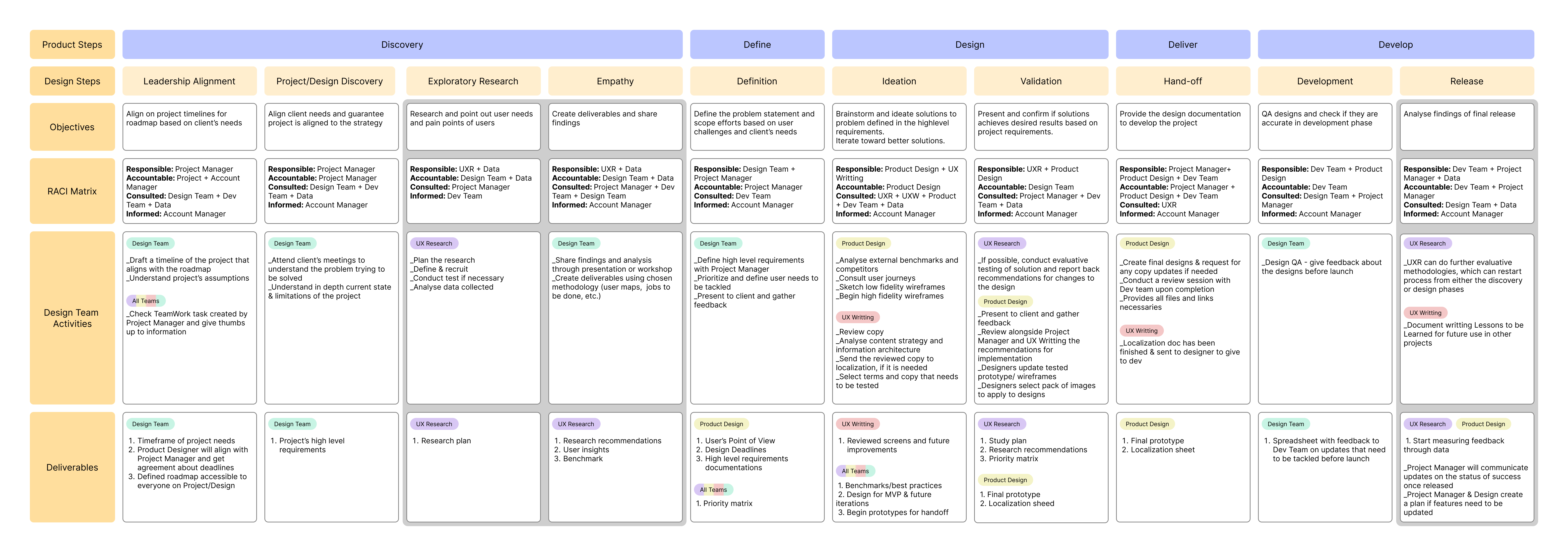
A Design Process Matrix
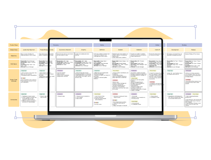
Aiming to provide an integrated perspective on linkages of the process, I draft this matrix based on the Four D’s diagram. This lightweight framework serves the purpose of identifying focal points and transitions and effectively practicing continuous improvement.
The complete design process can be accomplished once, or when one finds necessary. After gathering information, findings can be applied across different sub-products and the steps with gray background can be skipped.

Final Considerations
A design system has no usage if it doesn't bridge the gap from design to development. As for now, we are still in process of getting stakeholders and external development teams on the same boat.
Having in mind that a brand of this size has a substantial amount of turnover of professionals, I would also recommend a standardization of onboarding to expedite the process, keep the work consistent and make the new collaborator more comfortable and confident.
*For privacy reasons, I am not at liberty to show more specifically on what I worked.*